
How to Build a Squarespace Website Step-by-Step 2022: Planning a Squarespace Web Design Build
There are a few things that are worth setting up on the front end to ensure you crush your Squarespace website design from scratch.
If you skip these steps you could waste a whole lot of time and energy, even with an awesome website builder like Squarespace.
Knock these out before you pick colors or drag and drop blocks and the design process will be smooth.
Chapters


This is the first of the four steps for creating a Squarespace website. You can see our other tutorials on building a Squarespace website below:
1. Planning a Squarespace Website Build
2. Designing a Squarespace Website
Chapter 1
How To Use Google Keyword Planner For Free
SEO, or search engine optimization, is how people find your website through Google and other search engines. People can only find your website if you have words on it that are related to what people are searching for.
This process doesn't have to take a ton of time or cost any money. In fact, you can use Google Keyword Planner for FREE to find your website keywords.
What better tool could you use than the one connected with the largest search engine in the world, right?
Here’s how to use it for free:
Use the Chrome browser and open a New Incognito Window.
Go to ads.google.com, then click “Sign in.” Sign in with a Google account and click “New Google Ads Account.”
Now, the trick to get around sharing your credit card:

Click “Switch to Expert Mode.”

Click “Create an account without a campaign.”
Confirm your business settings and click “Submit.”
Then click “Explore your account.”
Click “Tools & Settings” and choose “Keyword Planner” from the drop-down menu.
You’ll get two options:
“Discover new keywords”
and
“Get search volume and forecasts.”
Use the first option to get keyword ideas.
You can now input topics or words related to your business, brand, product or service.
Also, think about:
What words or phrases would people use to find what you offer?
What questions are your customers always asking?
Notice that Google will give you suggestions to broaden your search. This can be helpful to direct you to terms or categories you didn't know about.
You’ll now see different categories:

Your keywords on the far left, then average monthly searches, competition and cost-per-click range.
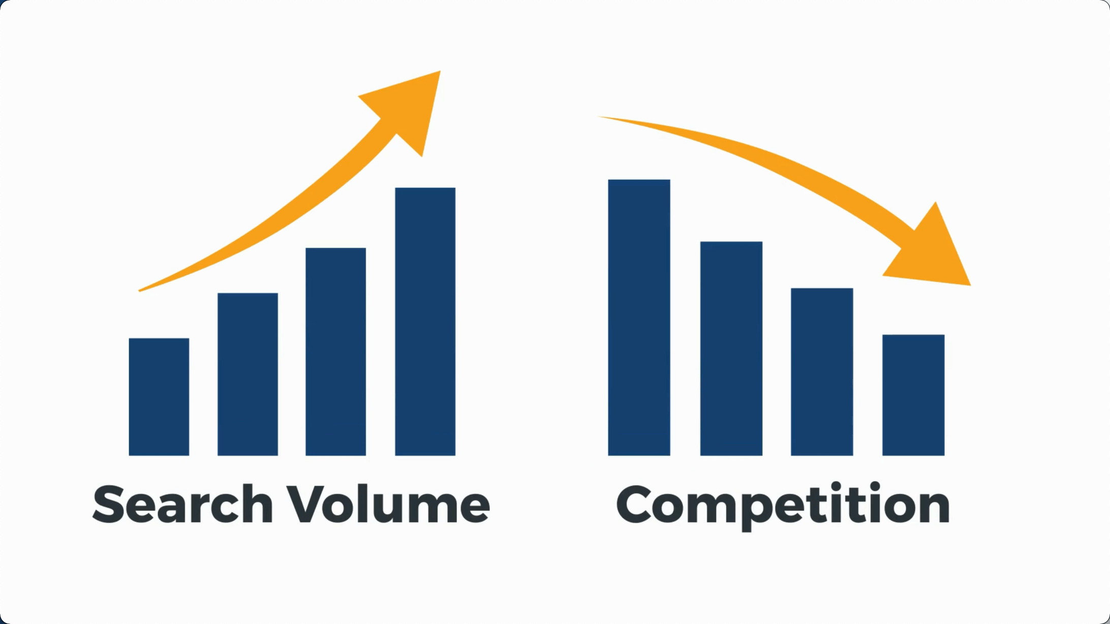
Keywords that have a high amount of search volume and a high amount of competition are what we would call your primary keywords.
Finding Your Primary Keywords
Primary keywords are the words your business has to go after no matter what.
They are so closely aligned with what you do that it doesn't matter if you aren’t able to rank for them within one month. You want to invest time now so you rank for them eventually.
I recommend finding 50 of these keywords. This smaller list will make it easier for you to cover them within your core pages.
You'll notice two prices, too: These are your PPC or price-per-click prices. Google Adwords allows people to pay to have their content appear on the first page of Google. These numbers give you a high and low range.
If you use Adwords, every time someone clicks your website's link you get charged the price for that keyword.

If the range is high, you can bet that other companies are paying for those specific keywords. Sometimes, even if a keyword has a lower search volume, it might have higher buyer intent.
If I typed in "car dealerships in Bloomington," this is a high buying intent phrase, even though Bloomington is a small town and may not have a ton of monthly searches.
Finding Your Secondary Keywords
You need to get some points on the board, even if they do not have the highest search volume. This is where secondary keywords come into play. These keywords are less competitive but are still related to your product or service. Ranking these words will eventually increase your site traffic and build your search engine rankings.
Shoot for well over 100 keywords here. Think about each keyword set as being worthy of a blog post or its own content page.
Look for keywords with a good amount of searches with low or medium competition.
This makes them easier to rank for.
Apply filters to narrow down the competition category.
Click the “Add Filter” button.
Click “Competition.”
Click matches that say “low” or “medium.”

The more competitive keywords will be removed.
To make it even easier, click “Avg. Monthly Searches” and it will now display keywords from the highest to lowest monthly searches that are also low in competition.
Now select keywords that:
Align with what you offer.
Align with what your audience wants to know.
Notice that as you check off keywords you can add them to a group. I recommend having one group for primary keywords and one group for secondary keywords.
Another way to find keywords is to type in the URL of one of your competitors. If you haven’t already, it’s good to have an idea of what kind of websites are appearing in search results for the terms you want to rank for so you can do it better.
If you go back to the Keyword Planner page, you’ll notice a tab that says “Start with a website.” Click the tab and enter a competitor's URL.
Voila! Now you can see what search terms they rank for. It’s worth creating another list just for the overlapping keywords that you will also need to rank for.
By doing this for a few competitors, you can see the keywords they have in common, as well as the keywords they may be missing out on.
Once you have your primary, secondary, and competitor lists, click “Download Keywords” and you’re good to go.
For now, I would recommend you copy these keywords and put them into Squarespace School’s free fillable Website Design Guide to keep all your content tidy and in one place.
Using Primary Keywords When Website Building
So now you have a list of keywords. As you are writing the website copy for your core pages, you are going to want to include your primary keywords. You’ll want to make sure to use them on your:

Homepage
Services page
About page
Portfolio Page
Contact Page
How NOT to Write Keyword Content on Your Squarespace Web Pages
If you try to spam or stuff keywords by placing them all throughout your site in an unnatural way, this will not help you.
Google is smarter than that.
This will hurt you.
Don't do that.
You will begin to discover how keyword research actually makes you a better writer and business because you are prioritizing the words of the customer when you’re creating content instead of what you think they want.
When you start to think about your content as being helpful and value-driven above all, you are on the right track.
This is the beginning of helping searchers find your content and having it rank on a search engine results page (or SERP for short). However, in order to support these web pages, we are going to have to create content. More on this later.
Chapter 2
How to Create Clear Site Goals For Your Website
What do you want people to do on your site? The answer needs to be crystal clear.
If you are an e-commerce store, you want people to buy your stuff.
If you are a restaurant, you want people to place an order.
If you are an online coach, you want people to book a strategy call.
Your site needs a primary goal.

This is the main reason you have a website. Without this, your website is just an online brochure and doesn’t move people in a direction to work with you or buy from you.
Your primary goal should be written down, preferably in the Squarespace School FREE fillable Website Design Guide. This will keep all your content ready and in one place.
Why Do You Need a Lead Magnet for Your Squarespace Website to Win Subscribers?
You need a plan B if someone doesn’t want to take you up on your primary goal.
Sometimes, especially for higher ticket goals, people will not buy or book right away. What can you give them to build trust in exchange for their contact information?
You need a way to stay in communication with them, even if they choose not to take action on your primary goal.
Your secondary goal is called a lead magnet.
This is a FREE thing you give someone in exchange for their:

Name
Email
Phone number (optional)
What kind of lead magnet you offer to those just browsing your website depends on the industry you are in.
Ask yourself, “How can I add as much value as possible?”
Is it a downloadable PDF on how to make the perfect vegan cake?
Is it a video course on how to get started with selling real estate?
Is it a fillable Website Design Guide?
People are more likely to buy from you when they have first trusted you with a small stepping stone, such as giving you their content information.
Why You Need an Email List for Your Squarespace Website

Is email still a thing?
Do email campaigns even work?
Do people still open emails from businesses?
Yes and no.
True, the majority of email addresses you collect may not become customers, but a good percentage of them will.
How good? Up to 5%.
Does that seem like a small amount? Well, that depends on how many email addresses you have and how much your product or service costs.
If I sell website design services, which I do, and five people out of a hundred take me up on an offer I send via email, that is a huge win.
If I have a hundred thousand people on my list, then things really start getting awesome.
Make sure you have both your primary goal and secondary goal written down BEFORE you build your website because it will shape HOW you build your website.
Chapter 3
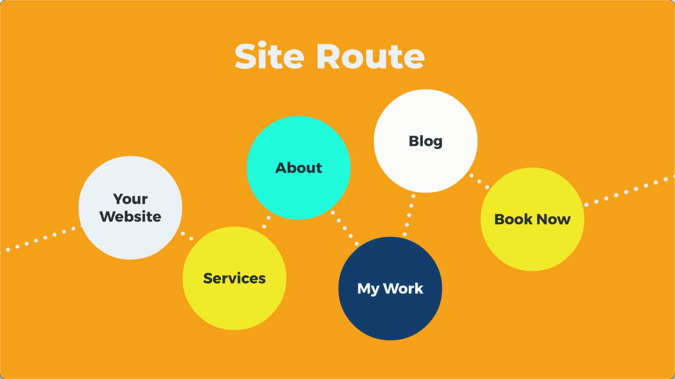
How to Create a Site Route for Your Squarespace 7.1 Website
Your site route is a path that someone will take to fulfill the primary or secondary goal of your website.
Most people don’t go from the homepage to checkout right away. You need to make sure they have a simple and clear way to get the information they need in order to take action.
What things will visitors of your site need to know in order to fulfill your primary goal?
If I am a tattoo artist, then people will probably want to see my work, look at my prices, and learn a little about me before they decide to book an appointment.
The site routes for this might look something like:
Home > My Work > Services > About > Book Now
Some site routes might be shorter.
A restaurants route could be:
Home > Menu > Reviews > Order
Or an e-commerce website might be even shorter:
Home > Shop
Put yourself in your customer’s shoes and think about the types of pages you would want to see before you bought your product or service.
Write down all the possible combinations of your site route for a user to complete your primary goal.
What are the essential pages needed for people to learn enough to buy or work with you? These need to be included in the top main menu header navigation.
Essential Rules for Header Navigation on a Squarespace Website:
Choose no more than five pages for your top navigation. (The homepage doesn’t count here.)
Any other pages that are important but don’t contribute to your primary goal can go in the footer navigation.
Blogs or content pages are a great way for people to learn more about your business.
The fewer items you have, the easier it will be for the user to navigate
Remember, navigation links can also have drop-downs, but you definitely don’t want to overdo it here.

A note about navigation menus for e-commerce stores:
Your top navigation will probably be the categories of your stuff.
For example, a clothing company might have the top navigation as Men, Women, and About, with a drop-down submenu for categories, such as shirts, pants, etc.
You are still going to need to map this out, but again, it’s good to have this done ahead of time, and I’ll show you how to create menus and submenus in a later course.
Make sure you write down your navigation menu items.
Chapter 4
How to Write Copy (Words) for Your Main Navigation Pages


How to Write Copy (Words) For Your Homepage
No matter what you are using your website for, you need to crush your homepage. According to Google Webmaster, all sites need to “give visitors the information they're looking for [by] provid[ing] high-quality content on your pages, especially your homepage. This is the single most important thing to do.”
So what are the essential sections of a Squarespace website landing page or homepage? (By the way: they are the same thing. If people land on your homepage, it’s a landing page.)
Mind. Blown.
Here are the 6 essential sections of a landing page or homepage of a website:
Let’s break these down so you can create them for your website. By the way, I have a free fillable guide that you can download in the description box to keep everything super clear and organized. I totally suggest you use that.
How To Write The One-Liner and Hero Section Of Your Homepage

Studies show that when someone lands on your website you have about 6 seconds to help them know exactly what you do. You need a one-liner.
This is a clear way to say what you do or the problem that you solve right away. If people are not clear you can help them, they will leave.
You see tons of websites that say things like:
“Great people doing great work.”
OR
“Helping you solve your complex problems.”
OR
“It’s time to begin to change your life.”
Here is the rule: If your one-liner can be applied to a different industry then it is too vague and needs to be more specific.
Can your one-liner also be applied to a church, a restaurant or a gym? If so, then you need to narrow it down.

Here is a simple equation:
Who you help + Where you help them + How you help them + The benefit you bring
For example:
“Helping dads in the Atlanta area lose weight to feel like themselves again.”
Or how about this one:
“Coaching business owners on the west coast to grow their company without burning out.”
Now, obviously, if you are not geographically bound you can leave out a location.
Here is Squarespace School’s one-liner:
“Helping everyday people grow their business and tell their story with an awesome Squarespace website.”
It cannot be overstated how much you need to nail this. This is your elevator pitch, the thing you put on your email signature—it’s everything.
Writing The Problem Section of Your Homepage
The problem section of your website is so important because it makes what you do valuable and interesting. The best stories have a problem, the best websites also state the customer's problem. This is also super helpful because it makes your customer feel understood.
The 3 types of problems you should describe are the physical, emotional and philosophical problems.

The physical problem usually comes down to things like time, money and energy.
You don’t have the time to take your clothes to the dry cleaner every day and traditional dry cleaning is expensive. It’s exhausting to steam and iron your clothes when you just want to hang out with your family.
The emotional problem is how these physical problems make you feel. You feel frustrated paying so much money, you feel tired from your long day at work, you feel anxious that you are not giving your family the time and attention they deserve.
Last, is the philosophical problem. Here, you state your beliefs: It shouldn’t be so hard to have wrinkle-free clean clothes for work every day. OR, you believe you should feel confident and clean at the start of each workweek.

On Squarespace School, we state:
“You Want to Create a Website,
But There Is a Problem…
You are not a professional designer and you don’t code.
You don’t have $15K to pay a web designer for something that will break in a year.
You don’t have the time or money to go to “website school.” (Remember that $15K thing?)”
When people feel like you truly understand their problem, they are more likely to trust you for a solution.
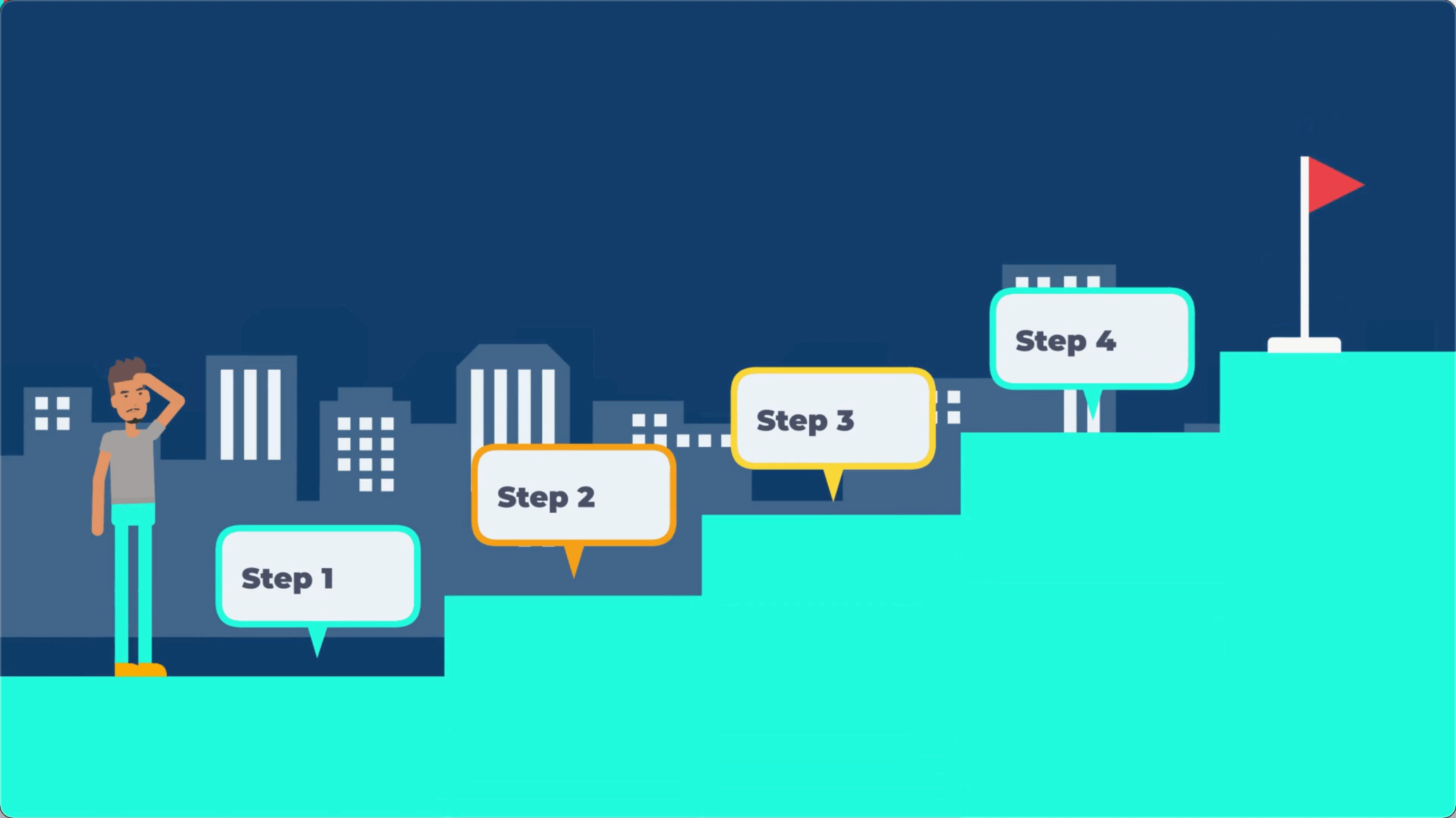
Writing The Steps Section Of Your Home Page
Here you want to show how you will help your customer solve their problem. It’s okay if these steps are simplified. They need to be. It should seem easy to do business with you.

Even the most simple products have steps. If you look at a microwave popcorn package, it says:
Step 1: Remove from package.
Step 2: Cook in the microwave for 2 minutes.
Step 3: Wait to cool and enjoy.
I know what you're thinking. That’s fine for popcorn, but my business is way more complicated than that.
To you, my friend, I say… exactly.
If a simple product has steps, then your complicated product or service definitely NEEDS steps.
Having steps—no more than three—makes doing business seem much simpler. It allows people to visualize the process it will take to do business with you. The more simple you make your steps, the easier it will seem for the customer.
Here Are Our Steps:
Use our FREE guide to organize your website plan to ensure you have the essentials. No admission costs. No secret fees.
Learn the fundamentals of Squarespace web design through fun videos and checklists. No code is needed. No boring content.
Put your new skills to work by designing a one-of-a-kind website for your business or for clients. No grades. No test
Most businesses struggle to make their steps simple enough. Remember, people do not go to landing pages to read. They skim. It needs to be very easy for the reader to understand the sequence of buying your product or service.
Writing The Expert and Empathy Section Of Your Home Page
This section has two goals. Show people you know what you are talking about and show them that you understand their struggle. You can do this in a few different ways.
To show authority, you can display logos of brands you have worked with, and mention where your product or service has been featured.

Show testimonials or briefly explain your credentials.
“Clint is a marketing genius on many accounts, but his knowledge of Squarespace and Local SEO was instrumental in getting our startup website launched.”

To build empathy, revisit the struggle your customer has experienced, or any of the problems from the previous section in different wording.
For Squarespace School we said:
“I was a teacher and wanted to create a website.”
This shows I have experience teaching, plus authority. (Actually, I have a master’s in teaching, but I am not trying to brag!)
“I tried everything. WordPress. Wix. Even a Google website.
Yes…there are Google websites, and mine was embarrassing.”
(This revisits the struggle.)
“I discovered Squarespace and became obsessed.
I spent a ton of money and time on courses.”
(Again, showing authority.)
“I learned so much, but I knew it could be simpler and way more fun.
So I created a FREE way to help people build amazing one-of-a-kind Squarespace websites.
It’s my way of doing a little good in the world.”
I’m not crying, you're crying.
Writing The Call to Action Section Of Your Homepage
Next, you want to call them to action. What do you want your visitor to do? Do you want them to schedule a call, fill out a form, opt-in for your free fillable guide or lead magnet? Start a free course? Live chat?
Whatever you want them to do, you have to tell them in no more than two steps. People will do what you tell them, but you have to explicitly tell them. All I want people to do is to start one of my free courses, so that’s what I tell them to do.
Writing The Imagine Section Of Your Homepage
Last is the imagine section. Here, you want your customer to be able to visualize how they will feel after doing business with you.

Here is an example I did for a dry cleaner client:
“Imagine having all your clothes for the week crisp and smelling fresh before you go to bed on Sunday.
You’ll be able to sleep in a little bit longer and take a few more bites of your breakfast because it will take so much less time to get ready. Here’s to slower mornings and long weekends.”
Notice I use words like “crisp” and “fresh” and things we can relate to, like sleeping in and chewing our breakfast. These help the reader imagine they are in that moment. They can see it.
For Squarespace School, we said:
“Imagine…
Never having to rely on a costly, time-consuming developer again.
Being proud to show off and send people to your website.
Turning a side hustle into a main hustle that you love.”
Chills, right? Just me?
Writing Copy for the About Page of Your Squarespace Website
The About Page is about 3 things:
Build empathy with visitors to let them know you understand their struggle.
Build authority with visitors to show them you can help them.
Build connections with them on a human level. (People like doing business with people.)
Similar to the empathy and authority section on your homepage, your About Page is meant to go deeper. To tell more of your business's story.

People.
Love.
Stories.
The “Right Place” Section of the About Page
Let visitors know they have landed in the right place by calling out why they are there.
Template:
You (state what the customer wants) but you are (state the customer problem).
(Assure them you can relate.)
Example:
“Tell me if this sounds familiar…

You need some work done on your car, but every shop you take it to tries to con you into hundreds of dollars of work when you were just looking for a tune-up.”
OR
“Can you relate…
You want to eat and connect with your friends, but you also don’t want to feel terrible from unhealthy food afterward.”
Build Empathy and Authority
Drop your visitors into the middle of the problem that your business tries to solve first. Explain why the business was created. What need were you trying to solve when the business was first created?
Template:
I/We get it. We knew that other people needed help with (problem).
That’s why I/we (created this service/made this produced/founded this company).
Now, I/we do (product or service) and have (X amount of clients, grown x amount of businesses).
Do you want to (solve the problem) once and for all?
Example for a teen treatment center:
“We understand where you are coming from. We knew there weren't a lot of options for teens to get help, including the members of our own family. We had to change that.
A 28-day program wouldn’t cut it. They need support that could bring lasting change.
That’s why we created Sandstone Care, to give teen-specific addiction and mental health services.
Now, we have grown from that one tiny outpatient facility to many locations across the country.
We have served hundreds of teens and young adults and helped them overcome substance use challenges and mental health challenges so that they can get back to smiling, graduating, and connecting with their families again.
Are you ready to give your teen the help they need?”
Call to Action Section

Tell visitors what they need to do. This should be related to your primary and your secondary website goals.
Example:
“Call an admissions expert today to get your insurance verified and in the meantime, download our free parent resource guide to learn about even more ways you can support your teen.”
Pictures of you or happy employees—preferably not stock photos—are a must here. Remember, humans, buy from humans. The more human your brand seems, the more likely someone is to do business with you.
Writing Copy for the Services Page of Your Squarespace Website
The goal of the services page is to explain:
Your product or services.
Make it undeniable they are top-notch.
Start With a Headline That States Their Problem and Your Solution:
Keep it short and sweet. Your products and services will always shine brighter after they are compared to shadowy problems your customer is facing.
The equation:
Your customer's problem + the solution you bring
Examples:
“We understand that you're busy running your business, which is why we run smart social media campaigns that grow your audience.”
OR
“You want to eat healthy meals at the table with your family without breaking the bank, so we developed a cost-effective meal prep service that will make everyone look forward to dinner again.”
Describe your product or services with the price loud and proud.

Each product or service should have the following:
A title.
A picture (even for digital products).
A list of benefits (not features).
A price (yes, you need to display your price).
A call to action button.
Title Your Products or Services
A title confirms the buyer is getting the right thing. It can also convey the current state of the buyer.

“The Entrepreneur Package” versus “The Executive Package” helps the buyer determine what they might need based on their status.
This works for products, too. Look no further than Apple for an example.
The Macbook Air is meant to convey lightweight flexibility for the digital nomad on the go.
The Macbook Pro is meant to show more firepower and increased features.
Use Pictures For Your Product
We judge so many things by appearances. I’ll explain how you can make 3D mock-ups later in the design section of our course, but what’s important to note now is you want your image to look appetizing.
For example, Squarespace sells websites, which are intangible things. Therefore, they often display their service on a laptop.
Images. Matter.
Explain the Benefits of Your Product or Service in a List

Here you need to remind the customer how your product or service will help them. Many websites get bogged down in things like how their jeans come in 6 colors or that they use reverse stitching on their boot cut.
Which one would you buy?
Stone Wash Jeans
6 different colors.
Reverse stitching in boot.
6 pockets.
Multi-fiber blend.
OR
The Ride or Die Jean
Easy matching with any outfit.
Durable tear-proof stitching.
Secret pockets to stash your valuables.
Stretch blend fiber for easy movement.
Pricing Your Product or Service
People know your stuff costs money.
People don’t appreciate having to hop on a call or demo to learn how much your thing costs.
People don’t like being surprised by getting excited about a product or service and realizing they can’t afford it.
If you care about your customer, you want to save them time. You also don’t want to waste your time talking or trying to sell something that is just beyond their budget.
If I am getting a massage, and I view three different local websites, I will immediately dismiss the company that says call for details. Ain’t nobody got time for that!
Putting your price on your website shows confidence that you are worth it.
If you are worried people won’t value your product or service without talking to you then be sure to make your website copy amazing. Or put a video of yourself on your website explaining why your product or service is worth the cost.
A Note About New Service Businesses:

New service businesses should try and limit their services to no more than three. This both helps customers decide and helps you home in on what you actually do.
You may be willing to do a ton of stuff to help your client, but think about what will help them the most.
For e-Commerce Stores...
Your Services Page is your shop. You’ll follow many of the same practices when displaying your stuff. Don’t worry, I’ll show you how to build out your e-commerce shop, too.
Writing Copy for Your Portfolio Page
The portfolio page is the place for you to show off all the amazing work you or your business has done. If you have data and examples from past clients you’ll want to make sure that is here.
The name “portfolio” is not set in stone. You want to make sure it makes sense with your industry. Whatever you name it, you want it to be very clear this is where visitors can view past examples of your work.
This is the “show me” page. If you are a photographer, video editor or web designer, you want to put examples of your work here.
If your business works with other businesses, you want to show charts or graphs that reveal how much money you have made your clients.

If you are a gym, you want to include before and after photographs and testimonials of happy clients.
Make sure the work you display is attracting your ideal clients. If you’re a tattoo artist who hates doing tattoos of sailors and skulls, then don’t display that work on your site.
Here is a simple way you can dress up your work to help give the visitor more context:

Show a picture or video of your work.
Describe the project. What did the customer want? What was the process like to meet their expectations?
Explain the results. How did it improve your client’s life?
Use your customer’s own words in a testimonial with a happy smiling picture of them, if available.
Call to action.
Repeat this with as much content as you have. A huge portfolio page that shows incredible results makes working with you a no-brainer.
Notice that you are not selling here, you are showing. Your results sell for you.
Writing Copy for Your Contact Page
A Contact Page is a must for most businesses. The goal of the contact page is to:
Answer people’s questions BEFORE they arrive in your inbox.
Let these informed and ready-to-work people get in touch with you.
Especially with large businesses, you’ll see that a FAQ section is usually on the Contact Page. That’s because these businesses have already spent a lot of time answering the same questions over and over.
A FAQ section allows people to call or schedule with you in confidence AND it prevents people from wasting your time.
For your FAQ section, list your customer’s top concerns:
Do you take insurance?
Do you have vegan options?
Are you currently taking new clients?
Can I hire you on a consulting basis?
Then answer these questions briefly, linking out to other source pages as necessary.
For example:
“Can you do modern and minimalist website design?
Yes! You can view some of my most recent geometric beauties HERE.”
This FAQ section can also come in handy on your services page, too.
Add a Search Bar to Your Contact Page
Adding a search bar will help people find the stuff they are looking for without having to fill out a form. Again, the goal here is to not waste your time answering questions that you have already explained elsewhere.
Drop In a Contact Form
Tell people when they can expect a response from you.
Example:
“We usually get back in 48 hours.”
Add the fields that are important to your contact form:
Name
Email
Phone Number
Question
Current Website
Etc.
Writing a 404 Error Page
You’re almost done writing the main copy for your core website pages. The 404 Error Page is shown to anyone who clicks on a broken link or mistypes a URL into your site.
All you need to do here is break the tension with a little bit of humor and point them in a direction where they can get some answers.

Example:
“So… I think we took a wrong turn.
No worries, use the search bar below to find what you are looking for or check out some of my most popular resources.”
We’ll go over how to build this page in later courses, but for now, think of a fun couple of sentences you can use to prevent widespread panic from landing on the wrong page.
Chapter 5
Best Practices for User Experience and Design With a Squarespace Website
Avoid these key rookie mistakes that let people know your site wasn’t built by a professional. Master this simple checklist and no one will know the difference.
Also, all of these tips will improve functionality and make your website as user-friendly as possible.
Make Sure Your Navigation is Simple and Clear
Websites are great places to express creativity, but your header menu is a bad place to be creative. It’s a map. We generally don’t like visually creative maps.
In general, only have 5 or fewer navigation items.
Don’t name your blog “ramblings on life.” Just call it “Blog.”

Keep the letters to a minimum. This is important, especially because your menu bar gets condensed on mobile.
The shorter your words, the better.
If you absolutely have to, you can use a drop-down submenu on an item, but even this should be kept very simple.
Anything else that is important but is not linked to the primary and secondary goals of your website can go in the footer.
There are some things that need to go in a footer, like your privacy policy or terms of service. More on this stuff later.
Use a Button at the Top Right of Your Website
Use a button for your primary goal at the top right. Studies show that the first thing our eyes are drawn to is the top right of a website. Then our eyes scroll left, then to the middle.

Use a Search Bar in Your Footer Navigation
This is great for a few reasons. Generally, it’s helpful to the searcher to be able to find stuff on your website.
Also, as you get more and more traffic to your website you can go into Google Analytics to see what people are searching for on your site.
This will allow you to:
Get to know your customer more.
Answer common questions ahead of time on your site.
Display content that more aligns with your visitor’s goals.
Make Your Squarespace Website Photo Quality Great, Even If You Are Not a Pro Photographer
If you have professional photography, awesome. Use it.
If you are like most people that don’t, then you are going to have to get creative.
Use Stock Photography… Smartly
If you are using stock photography from free websites like Pexels or Unsplash, then try to use photos from the same photographer throughout one page.

Modify photos in Canva to make them more interesting. I walk you through this step by step in a later design course.
Create a transparent background and swap the background or create a collage.
Use shapes or frames for photos.
Change the colors of photos.
Use photo overlays or filters like ones on Picsart or BeFunky to create an animated or unique look.
Opt-out of photos altogether and just use shapes.
Use clipart or graphics like the ones on Undraw to display art in a consistent way without a single human model.
Keep Your Photo Image Size Below 500 KB
Large photo sizes for image blocks or backgrounds are the number one thing that slows down site load speed of a website.

In general, a PNG is a larger file size than a JPEG.
Make sure any image uploaded to your Squarespace website is under 500 KB, but still remains crisp quality.
An easy way to do this is to run your photo through TinyPNG.com. They’ll compress the file, and you can see the sizes of the original and the compressed versions.
Make Sure Your Image and Text Don’t Clash
It’s important to make sure that people can read your text and that you use contrasting image and text colors. There are a few ways to accomplish this:
Change the image or the text color.
Blur the image or background.
Change the focal point of an image.
Again, more on this later in the course, but it’s good to be thinking about now.
Make Your Opt-in Pages Simple and Direct

An opt-in or a landing page is a page that has one goal, usually tied to your primary or secondary goal. It’s the finish line, it’s the place where someone is going to decide whether to buy your product or service or not.
Have one call to action on this page and repeat it multiple times.
Your homepage might have a button for someone to learn more about you or the company, to view your services in detail, or to look at your portfolio. However, the opt-in page is meant to either make the sale or get someone’s contact info.
The calls to action should be simple and direct. Subscribe now, buy now, or begin learning for FREE are the types of CTAs you’ll see here. It’s okay if you change up the wording for these buttons, but the destination should be the same.
If you have a picture of the product, use it. If it is a digital product, create a 3D mockup (more on this later). Use a picture of a person looking at and/or pointing at the opt-in form or button. People look where other people are looking.
Make Your Text Large Enough and Scannable

It’s cool to be artsy, but many websites have fonts that are too small for most people, and they will just click off your site if they have to struggle to read it.
Follow these simple guidelines for an awesome user experience:
Use a font size that is at least 16px. (I’ll show you how to set this in the site styles section.) Minimalism is super cool, but not small-ism. Even if you have great eyesight, accommodate the average person on the desktop.
Avoid or minimize cursive fancy writing that is difficult to read, especially for more than a word or two. No one wants to read a paragraph that looks like it was in the declaration of independence.
Write paragraphs no longer than three lines. Make the enter button your best friend. People don’t read, they skim. If they see a big blocky paragraph they will skip your information. A wall of text is intimidating.
If a paragraph is more than two lines, then left-align it. When you have to go to a new place at the beginning of each line it is frustrating for the reader.
Make.
It.
Easy.
Just left align it.
Use Spacing In Your Sections

People do not like to read or view things from one side of their computer to the other side, or from far left to far right. Reduce the cognitive load by using spacing. (Meaning space on the sides and in between sections of your content.)
Use different sections of a web page every time you are completing a new thought. For example, each section on our homepage design has a different look and feel.
This makes things interesting for the browser and helps to organize your material. Each section should be roughly the size of the page.
Think of this like a PowerPoint slide presentation that only scrolls down. There will be a similar tone and style between the pages, but the actual content and topic will be different.
Have at Least One CTA on Each Page
You cannot rely on people to go to your navigation to get to your stuff. You need to make things easy. Put buttons or hyperlinked text throughout the page.
It’s even okay if each button change takes browsers to the same place. Just change up the text a bit. On the Squarespace School homepage we have the following CTAs:
“Get Started”
“Take First Course”
“Start First Course”
“Begin Learning Now”
All buttons go to the same place.
Design Best Practices for Squarespace e-Commerce Sites
If a shop is only one part of your business, then have just one “SHOP” link in the header.
If e-commerce IS your business, then your header might just be different categories of your stuff, like men, women, tops, bottoms, shoes, etc. It’s also okay to have more than 5 navigation items if you are strictly an e-commerce shop.
Include a search bar, but only allow it to search for your products. More on how to do that later.
Remember that product titles can be keyword-rich. Name your products what you think people might type into search engines.
Don’t call your running shoes “foot sweaters with rubber bottoms,” call them “women's minimalist running shoes.”
Photo Guidelines for Squarespace Online Stores
Use great photos for your products. Duh. But also try to include multiple photos from different angles depending on the product and features you want to highlight.
Use a Recognizable Visual Reference for Your Products

It’s helpful to have something in the photo that gives reference to how big or small a product is. For example, if you sell mugs, showing a person holding your mug will give the shopper a better reference for its size.
Photos can also be useful when trying to display the different uses and sizes of your product.
Show your product on a variety of models, especially for clothes. Everybody’s body is different, and you don’t want someone to not buy your product because all your models are super skinny or super jacked.
Before and after photos can help the shopper visualize HOW the product will work.
Answer Common Questions People May Have About Your Product, Especially Around Size
People don’t do well with numerical measurements. Don’t say it’s 8 inches tall and 4 inches wide, say it’s about the size of a DVD case. (Remember those?)
Use Comparisons to Help Determine Which Version of a Product Is Best for Them
When displaying multiple versions of a product, stack each version next to each other so you can do a comparison at a glance.

Help People Find Your Products Based on a Goal
Sometimes, especially for supplement products, it can be challenging to know which product you need.
You might not know the difference between oolong tea and rooibos tea.
But if you help customers search by goal, for example, “Eczema Relief” or “Antioxidant Boost” or “Help Sleeping,” you can then display the teas that offer those benefits.
Keep Options Simple for Better Results
Sometimes less is more. Option anxiety is a real thing. Studies have shown that giving people fewer items to choose from can actually encourage them to buy more.
We have all been to a restaurant that displays a novel for a menu. These places often don’t do any one thing exceptionally well.
However, a fancy restaurant displays just a few items to show how much effort and care goes into each dish.
Whether you are a large or a small business, keeping your options simple and clear will drive more sales. If you want to sell products, then less is more.
Chapter 6
How to Use Other Website Examples for Inspiration Without Copying Them
It’s good to have an idea of what you like and don’t like for your website before you start building.
Most people who start out creating a website do one of two things:
They choose a Squarespace template and struggle to fit their content into preset boxes.
They copy another website example that looks like everyone else in their industry.
You don’t want to fall into either of these traps, and you don’t have to. Website templates are great for ideas, but they shouldn't limit your vision.
Here is how to get inspiration from other websites and examples without copying them.
Using Canva for Inspiration
Canva is a free design tool that I absolutely recommend for any Squarespace website build. Squarespace and Canva go together like peanut butter and jelly.
There is also a $12 dollar per month subscription that I absolutely recommend for its extension of free images and templates, ability to download PNGs with transparent backgrounds, and quick resize ability.
You. Need. Canva.
Use Canva Presentation Templates to Map Out Your Website Sections

As mentioned earlier in the design best practices section, you want to use a different website section every time you are talking about something new or explaining something in a different way.
Use one section when you are explaining why people should trust you. Use another section when you are displaying your most recent blog posts or videos.
Presentation templates in Canva are great for a few reasons:
They show layouts like you would see on a web page.
They show cool color palette combinations.
They have tons of great icons, photo frames and combinations of photo frames that will make it easy for customization.
The key here is to choose sections that vibe with the type of website you are going to create. For example, don’t choose a photo-heavy template if you don’t have a ton of professional photography.
Feel free to select colors from one template and icons and images from another template.
Use Pinterest to Get Inspired for Specific Sections
Pinterest has a large number of website design pins that you can save to a board of your own. I like the following search terms:

Presentation layouts
UI/UX design website
Cool website design
Modern website design
You can also follow my curated Pinterest board of website layouts to save even more time.
The key to looking at other templates and examples is to pull out HOW they laid something out without trying to copy WHAT they laid out.
You might even create different boards for the different types of sections that you will need for your website, such as homepage, about, shop, portfolio, etc.
Use other websites for inspiration
Go through your favorite website and jot down WHY they are your favorite.

Is it their easy navigation? The way they use graphics? Their colors?
Pull your favorite things from each of these websites, just as long as they are parts and not everything. Remember, to have a slightly different feel for each new page of your website depending on its goal.
This can be especially helpful when you pull from industries that are very different from your own. I like the color scheme of the graphics of Headspace, and the blog layout of Backlinko.
Think of it like a beautiful Frankenstein creation where you are choosing the things on websites that spark joy for you. (Yes, I love a Marie Kondo reference.)
Screenshot these specific sections and upload them to Canva to use as inspiration later on, or copy and paste the URL you love into your Website Design Planner.
Are You Ready for the Next Course?
Here is your checklist so you know you are ready to begin designing your website and laying down some content blocks:
You have your primary keywords for your website core pages.
You have your two site goals, header site navigation items and clear site routes.
You have the words/copy written for your core web pages.
You have a clear understanding of design best practices.
You have templates and website examples you love.
Once you have all of this stuff in your Website Design Planner you are ready for the next course: designing and creating a Squarespace website.
Frequently Asked Questions (FAQs) About Squarespace Website Design
We laid out some of the most common questions and answers around how to build a Squarespace website.
How Long Does It Take to Build a Website on Squarespace?
A standard 7-page Squarespace website can be built in as little as 3 days to 2 weeks if content, such as image and website copy/words, are chosen and written in advance.
This also assumes the designer is spending 8 hours or more a day on the website. If the website is larger or the designer has less time to devote to the building process the build can take longer.
How Much Does It Cost to Build a Website on Squarespace?
Squarespace.com gives customers a free 2-week trial for every website. Therefore, a website could be built for free. After the two weeks, you will only have site availability if you purchase a plan.
You can get a free domain name or a custom domain if you purchase any annual plan.
There are four paid plan options to choose from:
The Personal Plan at $16 per month, or $144 annually.
The Business Plan at $26 per month, or $216 annually.
The Basic Commerce Plan at $35 per month, or $312.
The Advanced Commerce Plan at $54 per month, or $480 annually.
Each plan grants more functionality and customization features. Also, the transaction fees are different between the paid plans when selling products and services depending on your Squarespace account.
You can check out a complete comparison of the plans HERE.
Can I Build My Own Website on Squarespace?
Yes, you can build your own website on Squarespace. You do not need to have any website building experience or know how to code or do custom CSS or install any added plugins.
Why Do People Say Squarespace is Bad?
People say Squarespace is bad because they have:
Never built a website on the platform.
Do not have a detailed understanding of its capabilities.
Have tried to create a website, but did not see results because they did not follow best practices.
There are many successful businesses and entrepreneurs that use Squarespace with great results. Knowing the essentials, like those taught in Squarespace School, will help anyone build a high-functioning website with great SEO.
Can You Make a Free Website With Squarespace?
Though you can build demo content on a 2-week free trial with Squarespace, and up to 6 months if you're a Squarespace Circle Member, you will have to purchase a plan after the two weeks are up.
What Is the Best Web Hosting for Squarespace?
If you are building a Squarespace website, then Squarespace.com is your web hosting platform. This is different from the domain hosting sites like GoDaddy that just host your domain name.
In short, you can have your domain hosted off of Squarespace, but your website will be hosted on Squarespace.
How Do You Make a Website on Squarespace?
Making a website on Squarespace comes down to 4 primary categories:
All four categories are taught for free here at Squarespace School.
What Is the Best Website Builder and Why Is It Squarespace?
Squarespace is the best website builder because of its incredible functionality and customization, coupled with its low cost and easy to learn usability.
How Do I Set up a Squarespace Website and Get Started With Squarespace?
Planning your Squarespace website comes down to setting up your primary keywords, mapping out your site navigation, and writing the copy/words of your web pages.
Once you have completed this and are ready to start designing, you can see our full guide to getting started and then designing your website. We walk you through each and every step that you will need to create a custom, one-of-a-kind website on Squarespace.